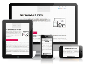
34Grid is a Responsive Grid System based on "equally distributed columns" layout basis. In contrast to other great grid systems (@see bottom of page), 34Grid provides equally distributed columns for each row. (and also column complements for inequal distributions)
If you're already familiar with grid systems and responsive web design just create&download a bundle and see what is inside. Else you may start with resizing your browser window.
34Grid downloaded 17024 times, it's your turn! No it is not, it has been retired!
Use customization options to create your own bundle. You' ve four options defined in options section below. If you're not familiar with grid systems, before you dive in, move around page for better understanding.
After you download 34Grid bundle, you'll have a zip file. It includes 2 folders named "css" and "demo". "demo" folder contains a simple "layout.html" page which shows possible column setups for columns and complements. "css" folder is your project file. Move this folder (or its contents) to your project to start using 34Grid. "css" folder has 2 files, one for columns, complements and necessary styles for whole system and the other for media queries.
34 Grid System seem so ugly when you just consider "layout.html". Don't panic! It’s just a scheme for selecting appropriate columns for your project layout. In a real design we won’t use both 1,2,3,4,5,6,7, ... columns together and ordered like "layout.html". We often choose 1,2,3 and 4 columns and use them as layout. So, don’t panic. @see sample pages below. @see layout.html for this page.
There is also a width preview calculator you have in the form. ("toggle calculator" link) A percent-pixel conversion table to preview 960px, 480px, 320px widths of selected values. (click "a little help" link to see dividableBy, margin, rowMargin in action)
Customize
Options
dividableBy
Select a number to equally divide a single row. This option tells builder to create an n equal columned layout.
margin
Left and right margin for each column or you can think margin option as half of margin between each of your column (col_1, col_2, ...) element.
rowMargin
Margin for a complete row. (actually it's one col_*'s bottom margin)
transitions
A simple transition effect addition for each of your col_* classes. (considering you use default layout markup for your design)
Markup & Classes
CSS Part
-
.container
Main wrapper class. Use ".container" class as your holder for ".row" groups. You can control max. width of your content with container class in each @media state.
-
.row
Consider ".row" classes as semantic grouping blocks. You can dump more than one "100%" width content in a single row. Here is the math: "A row can contain [n*100%] columns, so you can start 2 col_2’s and then without defining a new row continue with 3 col_3’s then 4 col_4's and so on.."
-
.col_1, .col_2, .col_3, .col_*
Different width options for your design. col_1 is a single cell in a row, col_2 is 2 columns in a row, col_3 is three equal columns for a row and so on..
-
.col_1c, .col_2c, .col_3c, .col_*c
Complement classes are unequal distributions. A complement class fullfills it's main class and provides a 100% width. (".col_3" + ".col_3c", ".col_4" + ".col_4c, ...")
-
.skip-float
When you use n*100% width content in a single row, if first column of current full width group is taller than all subsequent columns then we got a floating problem. But don't worry, solution is fairly simple. Just clear left of new 100% groups first column with .skip-float class. There, we got a new line. see tutorial image #1

.skip-float works autonomous. It places a brand new line to break with preceding 100% width group in same row group. But what if we need to float our columns in same 100% width group? Here the boring and problematic part comes. When it comes to same row group floating, we need to control each problematic non-floating column in it's own @media state in queries CSS file. It's hardly-manual but mandatory for now. see tutorial image #2

-
.video-holder
This class does some extra work. With a little CSS trick you can embed youtube, vimeo videos responsively to your web site. It's easy to use, just wrap your embed code with ".video-holder" class.
-
img, object, video, figure
In 34Grid, visual elements are automaticly resizing to 100% width. If you want to change this default behaviour, simply delete CSS code related to this elements.
HTML Part
<!--main wrapper class for all content-->
<div class="container">
<!--row of 1 (single column)-->
<section class="row">
<div class="col_1">col_1</div>
</section>
<!--row of 2's-->
<section class="row">
<div class="col_2">col_2</div>
<div class="col_2">col_2</div>
</section>
<!--row of 3's-->
<section class="row">
<div class="col_3">col_3</div>
<div class="col_3">col_3</div>
<div class="col_3">col_3</div>
</section>
<!--row of 4's-->
<section class="row">
<div class="col_4">col_4</div>
<div class="col_4">col_4</div>
<div class="col_4">col_4</div>
<div class="col_4">col_4</div>
</section>
<!--row of 5's-->
...
</div><!--eof container-->
HTML Part (complements)
<!--main wrapper class for all content-->
<div class="container">
<!--3 & 3's complement-->
<section class="row">
<div class="col_3">col_3</div>
<div class="col_3c">col_3c</div>
</section>
</div><!--eof container-->
Video Content
<!--video content-->
<div class="col_[*]">
<p class="video-holder">
<iframe width=640 height=480 src=http://www.youtube.com/embed/WUz-WqUw4Ic frameborder=0 allowfullscreen></iframe>
</p>
</div><!--eof video-->
Visual Content
Images

Placing images to col_*'s are easiest. Just place the image into your HTML without passing explicit width and height to HTML img tags. By max-height setting in CSS, you can restrict image spreading.
Videos
Video content placement has a little CSS trick. I found the trick at webdesignerwall which refer to a list apart. I choose the tricky CSS implementation for video content resizing, but you may use other javascript libraries surely.
Figures

Wanna stay in touch with semantics? Don't hesitate to use figure element with 34Grid.
Sample Sites
Icon Showcase
Simple Portfolio

Patterns

Your Site..

Known issues
floating problem
Yes, it’s big. ".skip-float" does not resolve all our problems. Only solution is manual control in each media query state or defining minimum heights for our conflicted column groups. See this page's source for better understanding (look for .user-float-for-* class) or .skip-float tutorial image #2 at "Markup & Classes" section.
issue 2
This section is waiting for your contribution. Please don't hesitate to write me about issues.
kemalxyz at gmail dot com
issue 3
This section is waiting for your contribution. Please don't hesitate to write me about issues.
twitter.com/xkema
issue 4
This section is waiting for your contribution. Please don't hesitate to write me about issues.
Tools I used
An all free grid system, created by all free tools.
Probably you know all about this free tools but i wanted to appreciate their developer's & designer's great work and mention them in here again. (and also to show 34Grid's col_5 and col_5c classes' in action)

Sublime Text 2
Code editor, surely, was the biggest part of the 34Grid work and luckily i come up with Sublime Text. It is a great code editor for all your coding needings. I finished whole 34Grid project coding with Sublime Text. (HTML, jQuery, javascript for website, PHP for builder) All coding experience was awesome. Here is the link to get it free. (for now) Sublime Text 2

HTML5 Boilerplate
My favorite initiater. Really great coding experince in a zip package and completely free. HTML5 Boilerplate

Mustache
A great templating engine with rich programming language support. (used it for builder script) {{ mustache }}

Subtle Patterns
Rich tilable patterns collection for free. Don't forget to check out their GitHub page to get Photoshop *.pat file. Subtle Patterns

jQuery
Everybody knows jQuery. jQuery

FileZilla
Everybody also knows FileZilla who knows jQuery. Filezilla

PHP
Just use it! PHP

Wegraphics
Great resource for both free and premium web design content. Wegraphics

ParaType
Free PT Sans Narrow fonts by PataType. Check out it's premium edition here. PT Sans

Flavour Icon Set
Oliver Twardowski's famous addictive flavour icon set. All high quality icons comes with layered photoshop files for free. Flavour Icon Set

brankic1979
Another good resource for web assets. brankic1979
Other inspiring grid systems
-
cssgrid.net
12 column, easy to use, responsive grid system by Andy Taylor. cssgrid.net
-
responsive.gs
12, 16, 24 column options, great templating capability. Responsive grid system by Denis Leblanc from Studio Snapsize. responsive.gs
-
960.gs
Master of all grid systems i think. All you expect from a grid system is in your download bundle. By Nathan Smith. 960.gs
-
gridpak.com
Another different approach to responsive grid systems. Controllable breakpoints, highly customizable and easy-to-use generator. Created by Erskine Design. gridpak.com
-
responsivegridsystem.com
A percentage-driven grid system. All uses percentage values to work with any width. Created by Graham Miller. responsivegridsystem.com
-
zurb playground
Zurb's on the fly CSS grid generator. So easy to use interface. (I also used zurb's textchange event in my bundle creating form) zurb grid generator
-
getskeleton.com
Skeleton is more than a grid system. A collection of CSS files which includes typography, buttons, form elements, ... and a good grid system. Created by Dave Gamache. getskeleton.com
-
twitter bootstrap
A complete collection of design & development needs. Something big. Bootstrap has a 12 columns responsive grid system by default. Developed bt Twitter. twitter bootstrap
About
class' naming
Class naming syntax of 34Grid (col_COLWIDTH) is a little confusing if you used other grid systems before 34Grid. In 34Grid, COLWIDTH part in col_ names says "current row is being divided by COLWIDTH". (so if COLWIDTH is 5 current row is being sliced to 5 equal part.
col_1's are full width columns, col_2's are 2 equal columns, col_3's are 3 and so on...)
column breaking logic
34Grid is bundled with a simple column breaking logic. It’s just default behaviour for grid system. You can customize it as your needs. Basic question for column breaking logic is "how can i construct a row with n equal cloumns?". So, considering a 10 equal columned layout answer is simple: 10, 5, 2, 1. This 4 values are our media states. If you consider 12, now you have 12, 6, 4, 3, 2, 1. It has 6 different states. (yep 12 has the richest set up option for column breaking and my favourite:) @see icon showcase sample)
Lastly for a prime numbered column like 13 we just have 2 states which are 13 and 1. (prime columns are being divided only iphone portrait layout state)
here is the bundled breaking logic
- If number of columns (dividableBy) is less than 8, start writing queries from ipad landscape (1024px) else, start writing queries from ipad portrait (768px).
- Break columns in each media query state if current column is dividable by an integer other than 1 and column itself.
- Special handling for column number 3 (three equal columns for 1 row). Postpone query writing for 1 state.
- Special handling for column number 2 (two equal columns for 1 row). Postpone query writing for 2 state.
- Do not break columns until last query state if they are primes greater than 3. (5, 7, 11, 13)
- At last query state drop left and right margins of all columns and set all columns to 100% width.
34?
Unexplainable part of 34Grid.
the idea
It was simple, to not to repeat same processes again'n again.
prerequisites
Some HTML knowledge, some CSS and a little grid based design stuff..
developer
it's me!
contribute!
Ask questions, share experiences, report bugs. I didn't test everything in 34Grid so some feedback would be good. Don't hesitate to write me anything about 34Grid.
free
Just use it. If you need a physical license @see license info in footer.
Social Widgets
Widgets guideline
Get your hands a little dirty here. I don't like twitter, facebook default widgets. They're all scary for me. But sometimes... bla bla, you know the thing. :) Here we will override plugins' CSS codes to fit in with 100% width.
In this website, I used Facebook's HTML5 code and Twitter's default profile widget. Twitter offers a "auto width" option and it solves 100% width widget problem. For Facebook widget (HTML5 version) default widget wrapper's class name is "fb-like-box". And it follows an HTML scheme like "Facebook HTML preview".
To override inline styles, I used one of Chris Coyier's CSS trick. You can find it at css-tricks
Lastly here are the styles I added to my main CSS file with all "!important" value.
Overrided styles
Todo List
We need to do 4 simple things here:
Facebook HTML preview
<!--widget wrapper-->< ... >< ... >